
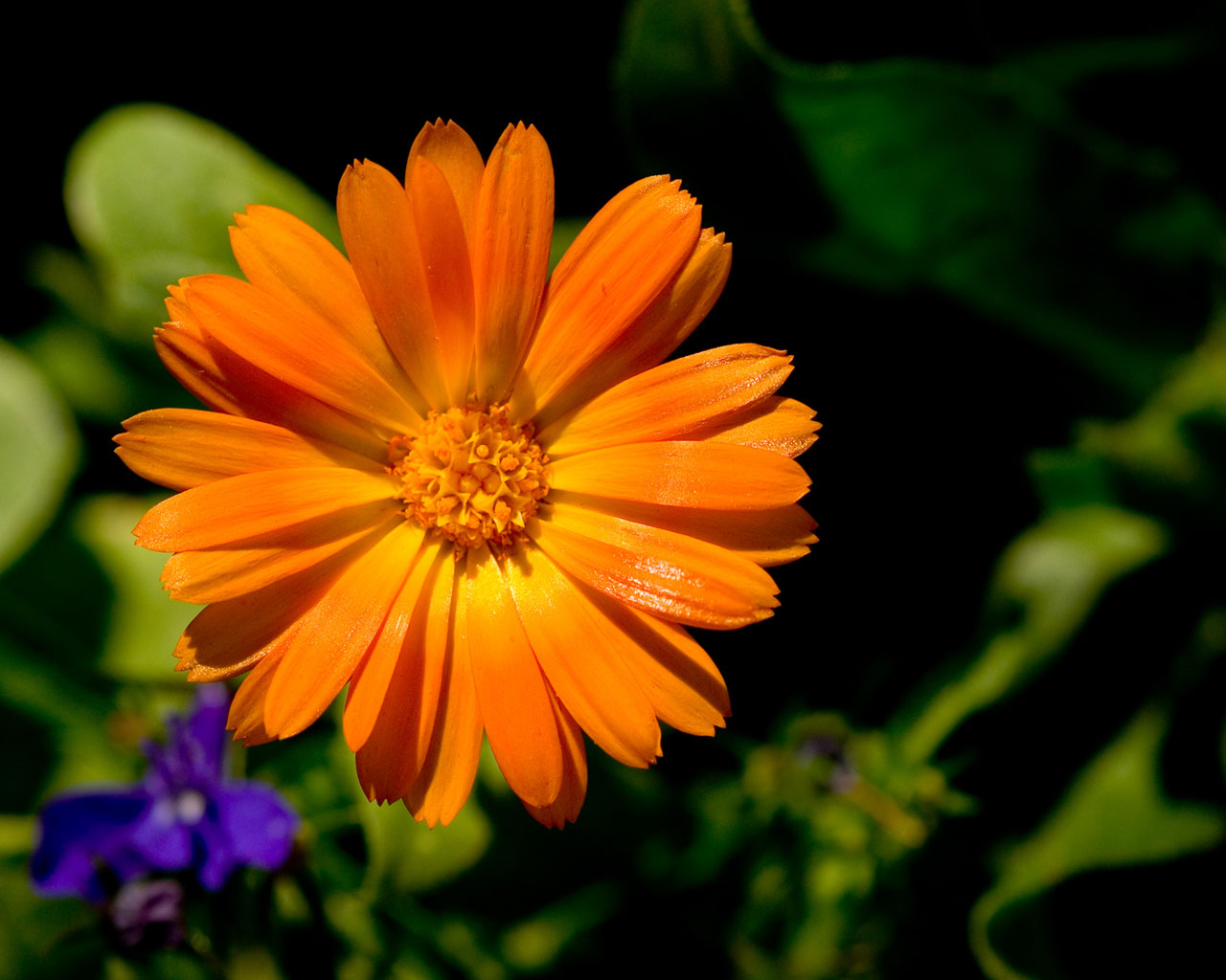
Normally, sunny conditions (especially overhead) are less than ideal situations for shooting, yielding washed out colors and harsh shadows. Sunny conditions do provide increased contrast, however.
The sun was weaving in and out of the clouds, so I was shooting anyways. The shadows and lighting are not diffused and the colors are slightly less brilliant as if it were morning or evening, but due to the flexibility of RAW image, I was able to increase saturation (in several ways, not just "saturation") and bring out the details in the shadows. Most of this was there even before the RAW processing (in the jpeg), but the photograph did gain some colors and detail that wouldn't have had otherwize. This is one of those sunny shots that just turned out. See larger image for sharpness and clarity.
Wallpaper:
800x600 | 1024x768 | 1280x1024 | 1600x1200
categories: flora macro nature
February 21st, 2005 at 5:07 AM
terific colour and the background goes very well with it,
but ithink you may have ovedone the saturation...
February 21st, 2005 at 6:26 AM
Beatiful detail, color, composition. I agree the saturation may be a few points too high. This makes a great wallpaper.
February 21st, 2005 at 9:07 AM
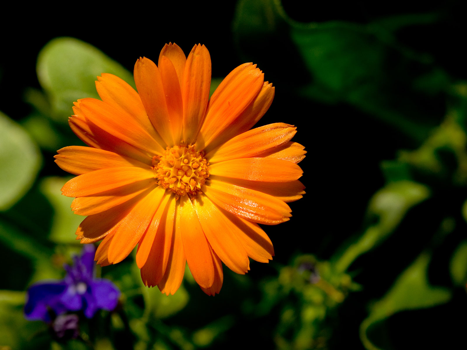
Too much saturation? Usually I'm the one saying that. Here's the original JPEG image as it would have been taken by the camera:
A little ligher, but not a whole lot. I do suppose it is slightly oversaturated. I'll keep that in mind next time.
February 21st, 2005 at 11:36 AM
Haha...from my mac the original looks more saturated. It's the way I saved it...and that I'm in safari.
Colorspace is complicated. *sigh*
February 21st, 2005 at 12:33 PM
yeah the origianal is better.
February 21st, 2005 at 1:11 PM
...for saturation, maybe, but not as a whole. The contrast is much better on the modified. And to me, the saturation is negligable;
the final photo isn't that much more saturated than the first.
February 21st, 2005 at 1:43 PM
I have to give this one a ten... this is by far one of my absolute favorite pictures :) GOOD GOOD GOOD job!!!!!!!!!1
February 21st, 2005 at 3:41 PM
the one petal glistening adds a lot, in my opinion
February 21st, 2005 at 9:20 PM
Thanks!
February 21st, 2005 at 10:17 PM
lol, I was just going to say that I didn't like the shine off the petal all that much. . . goes to show how different people have different oppinions :P.
lol
great pic!
February 21st, 2005 at 10:39 PM
I just want to say that I like the petal glistening... and I keep coming back to just stare at this photo... I honestly, love this photo!
February 22nd, 2005 at 12:04 AM
Art is subjective as well as objective.
February 22nd, 2005 at 2:45 AM
Very nice. Love the lighting, and the post-processing did make it a little better. Photos like this never seem "real" though. Sort of the "idealized" flower. But it's very good. Excellent composition with the offset.
February 22nd, 2005 at 3:10 AM
i also dislike the shiny petal. ;)
February 23rd, 2005 at 2:51 PM
Let the shiny petal be!!! For pete's sake, guys.
February 25th, 2005 at 1:13 AM
The shiny petal seems distracting. . .unnatural. . .out of place.
Thats why I don't like it :P
February 25th, 2005 at 1:14 AM
It's glistening in the sun! What could be more natural than that?
haha
February 28th, 2005 at 12:00 AM
I diagree with the over-saturation talk -- if it wasn't this saturated, it wouldn't be interesting; it would be a dull flower with a good dof. continue to be bold with your saturation levels - the best people on the net use it for great effect. think of it as stage performers putting on extra makeup to highlight the features of their faces that make their characters so much the more interesting.