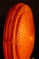
I experimented with quite a few saturation levels in combination with lighting adjustments and settled on this one. One of the reasons is the slightly more artistic nature of the photo, in which color (or lack thereor) usually plays a slightly larger roll. So, while you're free to add your opinion, it probably won't change mine. And just a note for future photos: I take care to adjust the color, saturation, brightness, contrast, and levels of every photo (among other things), so if it looks dark, it's meant to be that way...if it looks light or saturated, or whatever, I probably did it for a reason. Not that that is the "correct" way to do it, but it is how I subjectivly process my photographs.
A quick note: I had to fall back on my old php installation while I work on customizing the compilation to the php binary as some of the functions weren't working properly.
categories: macro
March 1st, 2005 at 7:38 AM
Suprisingly enough... I like it.
March 1st, 2005 at 10:15 AM
i like the contrast with your site and this pic. the orange against black is nice. the pic is kinda interesting on itself as well. =)
March 1st, 2005 at 2:25 PM
candy!
March 1st, 2005 at 2:42 PM
Look a little closer... ;)
March 1st, 2005 at 2:48 PM
Lol it does look a bit like a boiled sweet. its some sort of reflector isnt it?
good dof and lighting, i think you overdid the satruation again...
March 1st, 2005 at 2:54 PM
Yes, it is a reflector off of a construction barricade.
I wonder if I hadn't mentioned it, if the saturation would have gotten any notice. ;)
I encourage you to look at other photoblogs and their use of saturation. photoblogs.org is a good place to start. chromasia.com is the top listed photoblog and most of his photos are excellent...and the ones that aren't excellent are just very good. Daily dose of imagry is another fairly good photoblog. I'm not sure of the exact link, but it's in the top 10 on photoblogs.org.
Thanks for commenting.
March 1st, 2005 at 8:24 PM
I think that in a photo like this, that is pretty much only color, it has to be highly saturated in order for it not to be boring (I don't mean that it is, but I just mean that if it were not as bright, it would be a rather bland photo, if ya get my meaning :P) I like it :D
and to Philip. . .do u call candy a "boiled sweet" in the UK O_O
just had to ask that :P
March 1st, 2005 at 8:26 PM
Very good analysis of the technique, Mark. The same is true for desaturation. Sometimes you'll see photos with only a little color, and it is done to convey a certain emotion or effect.
March 1st, 2005 at 11:53 PM
I just like it... i don't have anything technical to add - it's just a fantastic picture and I enjoy the artistry. You did this quite well, Ryan.