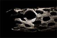
This is from the same set as these photos, taken over spring break. As you can see, this shot has more contrast, which is mostly because this is a blue channel exraction and the others were converted using straight desaturation. The lower contrast in the previous shots is also somewhat to blame on poor processing; if I were to do it over again, I would add contrast to the older two shots. All are sepia...I think it gives it a bit more texture.
Again, I am linking to a similar shot. The decision between these two was almost a complete toss up. I like the detail in the first shot, but there are many pleasing visual elements (paterns, etc) in the second. Your opinions would be appreciated.
categories: macro monochrome nature
June 14th, 2005 at 2:19 AM
Like I said before, I think I might like the other one just a little bit more. . .but they are both good.
June 14th, 2005 at 3:45 AM
I like it, especially the reflection below.....
June 14th, 2005 at 5:25 AM
Superb form - I also love the way the reflection rounds this image out.
June 14th, 2005 at 6:38 AM
brilliant ... the textures are really nice and that twisting pattern wild
June 14th, 2005 at 10:00 AM
Nice pattern. Strange thing ...
June 14th, 2005 at 1:15 PM
Very organic and skeletal in look, almost as if some animal has shed them as a dead skin.
June 14th, 2005 at 3:53 PM
Beautifully alien & abstract....
June 14th, 2005 at 10:26 PM
i can really feel the mood in this one. sepia work well here. nicely done!
June 14th, 2005 at 11:40 PM
ok, now this is just spectacular. looks like channel mixer is your weapon of choice in this shot. i'd have to give it a go someday.
June 15th, 2005 at 1:13 PM
I'm really starting to like low and high key images. This one really brings out the texture. I'm half expecting ants to come crawling out of it--looks like something out of National Geo or Discover.
June 15th, 2005 at 5:42 PM
I prefer this one, firstly because there is more detail, also I think the lighter area shows up better and more contrasty ;) Also this one looks more 3 dimensional to me where the other seems flatter.
There ya go :)
June 16th, 2005 at 7:19 AM
Again the details here are wonderfull. What an interesting piece of wood. Nice sepia effect too.
June 18th, 2005 at 9:56 AM
wicked image. love the dark contrast and patterns. very interesting shot.