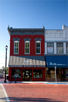
Looking the other way across the street this time. I didn't do the best job of processing this, and I'm not too pleased with the contrast, but I'm tired and don't want to re-do it....so just immage it looking right. ;)
Small perspective correction as well; it's still not perfectly lined up on the left side, but at least the horizontal lines are straight. It gives it perspective, I guess. Correct perspective is rather important for a head on shot such as this.
categories: architecture
August 9th, 2005 at 4:00 AM
This could well be a store in a Dickens book.
August 9th, 2005 at 6:50 AM
Ryan, I have not posted here for quite some time either. ;)
I understand that laziness always win when you get very tired. But I think you did pretty well here.
August 9th, 2005 at 8:35 AM
Very Nice... I haven't seen stone streets in a while... and "the shop around the courner" book shop bring me back to a very simplistic life... Not to mention the lighting is great :)
August 9th, 2005 at 9:30 AM
Fabulous contrast of shape and colour in this one, Ryan. Those vivid blues and red really pop.
August 9th, 2005 at 11:29 AM
This has the feeling initially of being too neat, precise and colorful to be real. But the cars to the left, the leaning street sign to the right of the store and the items stacked in the store windows give it away.
I love the rich colors and quaint look.
August 9th, 2005 at 7:56 PM
A lot of character in this one! The lighting and diagonal shadow add an interesting effect. Good shot! :)
November 29th, 2006 at 9:51 AM
Hi
I own the store in this photograph and just happened to run across it. Can you tell me about yourself and why you took the photo--and maybe get us a print of it for the store?
Thanks!