That's what it was trying to look through the viewfinder...Bright! (I think I probably ruined my right eye...ok, not really).
This was at the park on Sunday. Almost a year ago to the day, was last year's church picnic and the groundbreaking for the residence hall for our college. I took a similar shot then as well...unfortunatly, I think it surpasses this one.
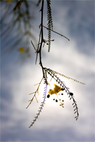
For those of you noticing the lack of color...this is at saturation +100%. :P
categories: nature
March 8th, 2006 at 4:23 AM
Yeah, I hate that brightness straight into the sun! You gotta be careful with that, you really could damage your eye, especially with a tele.
You're right about the image; not quite there. The other one you bring up (4/12/05) is better for a lot of reasons; interesting subject (large leaves are, not doubt about it), setting against similar forms in the bokeh (which I really like in the older one), a really great stem form with repeating "nubs," much (much) better composition, and (my favorite) the leaves on the top, which are smaller versions of the leaves on the bottom. You can read so much from that, not to mention that it's several times more pleasing to the eye than this one.
With this one, there's a lot I don't like. Portrait orientation doesn't work for me. Centered comp. is plain. Colors are drab (even at +100%? wow). Background is uninteresting. That blue smidge in the middle.. what is that anyway? The ultimate in chromatic abberation--right against the sun? hehe.
Haven't seen many good photos from you recently; not like in the past anyway. Stop thinking so hard maybe? Switch to JPEG for a while?............ Show us the good ones?? ;-) ;-)
March 8th, 2006 at 6:28 AM
Great light!
March 8th, 2006 at 7:47 AM
I actually really like this shot Ryan, it is definitely a departure from your usual style, but for some reason it captures my attention. The bright spot continually draws my eye to the center of the photo, and I think that the sudden change in color caused by the sun is both pleasing and intriguing.
March 8th, 2006 at 8:39 AM
I do like this, but I agree that your similar shot is better (colors and composition). I don't mind the portrait orientation in this shot, but I feel like it's upside down or I am. :)
March 8th, 2006 at 9:49 AM
If you like, Tristan, I can make you a print to hang on your wall, since you seem so fond of this shot. ;)
It is rather bland; I was debating about b&w but decided to go for more "subltle" colors.
The centeral composition is only on the horizontal axis...the vertical axis uses the ever popular rule of thirds. Centered composition should be used carefully, but should not be shyed away from completely. Here it works.
The background is supposed to be bland...it's a background! Backgrounds shouldn't be too busy, but should compliment the subject, which I think is one thing going for this shot.
Having said that, I know this isn't the most interesting shot, but you should be able to find a few if you scroll back. Not every photo of mine is going to be on a proffesional level. Sorry...I'm just an amateur hobbiest.
Also, if it's not too much trouble, comments with "constructive criticism" are significantly more helpful than "this is such a bad photo". Thanks again for all the comments.
March 8th, 2006 at 2:32 PM
Haha, how about a print of the older similar shot?
No, check your email. I'm sorry, I was in a mood. Definitely not me. This shot is fine and I actually like the way the background has that yellow splotch just like the foreground. Quite... ... interesting... ;-)
March 8th, 2006 at 7:34 PM
Good to see some constructive crit. :)
For my money - and not trying to be sycophantic at all - I think this shot rocks. I'm not a fan of portrait orientation (never ever shoot that way myself) but it really works here. The whole image has an upside down unconventionality to it. You certainly got that 'wow' from me when the image first loaded.
March 10th, 2006 at 1:00 AM
This works for me. I think it's sometimes pointless to dig deep into technical details because they spoil the overall experience of looking at a photo. As my current lecturer who's enthusiastically drumming poetical techniques into us would say: It is the emotion - what makes you feel the way you do when you first read/view something. We can only analyse from another point of view but never from the artist's. If you ask an artist what he has photographed, for example, this photograph, he will only tell you he saw the leaf dangling above and felt that it was lovely.
This is lovely. And it makes me feel pensive.
March 10th, 2006 at 10:18 PM
Oooh! I like this!