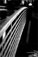
I did both a color and monochrome version of this shot.
I'm not sure which one I like better. The monochrome version is more artistic and has it's own advantages. I didn't like the color in the color version and so I messed with it and I'm not sure if it's any better...perhaps even worse, I don't know.
Well, enjoy it while you can. I took more great macro's today, but refrained from posting them. While I'm not exactly tired of macro's, I do see the need for photographic variety.
...which is why I keep posting bridge shot after bridge shot...
hmmm...
categories: architecture monochrome
April 21st, 2005 at 3:42 AM
hmm i like the B&W way beter. very artistic, nice contrast.:)
April 21st, 2005 at 3:54 AM
b&w, great light makes it for me on the railings against such a dark background. ;)
April 21st, 2005 at 9:56 AM
I like the B&W better too. Very nice. I like the lines that draw the eye along them.
April 21st, 2005 at 11:16 AM
I have to disagree. Of course, I'm not a photographer, so my opinion could be worth a hill of beans, but I prefer the color.
It's warm and inviting: I can imagine it as a background to a piece advertising a new class at church, or some kind of "journey". It very much symbolizes (to me) a crossing over or an invitation to take a step.
And the vibrant but dark water in the lower right is gorgeous.
April 21st, 2005 at 1:44 PM
Wow thats a nice photo, i love the btw and the dof too :)
April 21st, 2005 at 4:49 PM
I like it! It seems to go on forever. Cool effect and gret DOF.
April 21st, 2005 at 7:41 PM
The black and white picture is very striking. It's grabs the eye and keeps attention. Very nice. But the color one is beautiful. The colors are maybe a little different, but it looks more like a painting that way. It's soothing and warm all at once. Quite beautiful. They both have their own charm and I completely agree with you -- I can't decide which one I like better.
April 21st, 2005 at 10:29 PM
This is a great shot.
April 22nd, 2005 at 12:47 AM
Hmm, I don't mean to disagree with everyone, but I think I like the color version much better - don't exactly know why, but I think its the contrast of the orange bridge, and the blue water.
I love color contrast :P
April 22nd, 2005 at 5:29 PM
You post what you want to post! Don't hold back your excellent macros on my account...
April 22nd, 2005 at 5:30 PM
I should expand on that. Show us what you think are your best photos, but continue to vary your shooting of macros and landscapes and expand your horizons a little. Maybe you'll get some non-macros that you'll think are better than your macros, and then you can post those.
April 24th, 2005 at 11:16 AM
the mono is great. i like how the smooth background bokeh just adds to the atmosphere.